
Result Moment
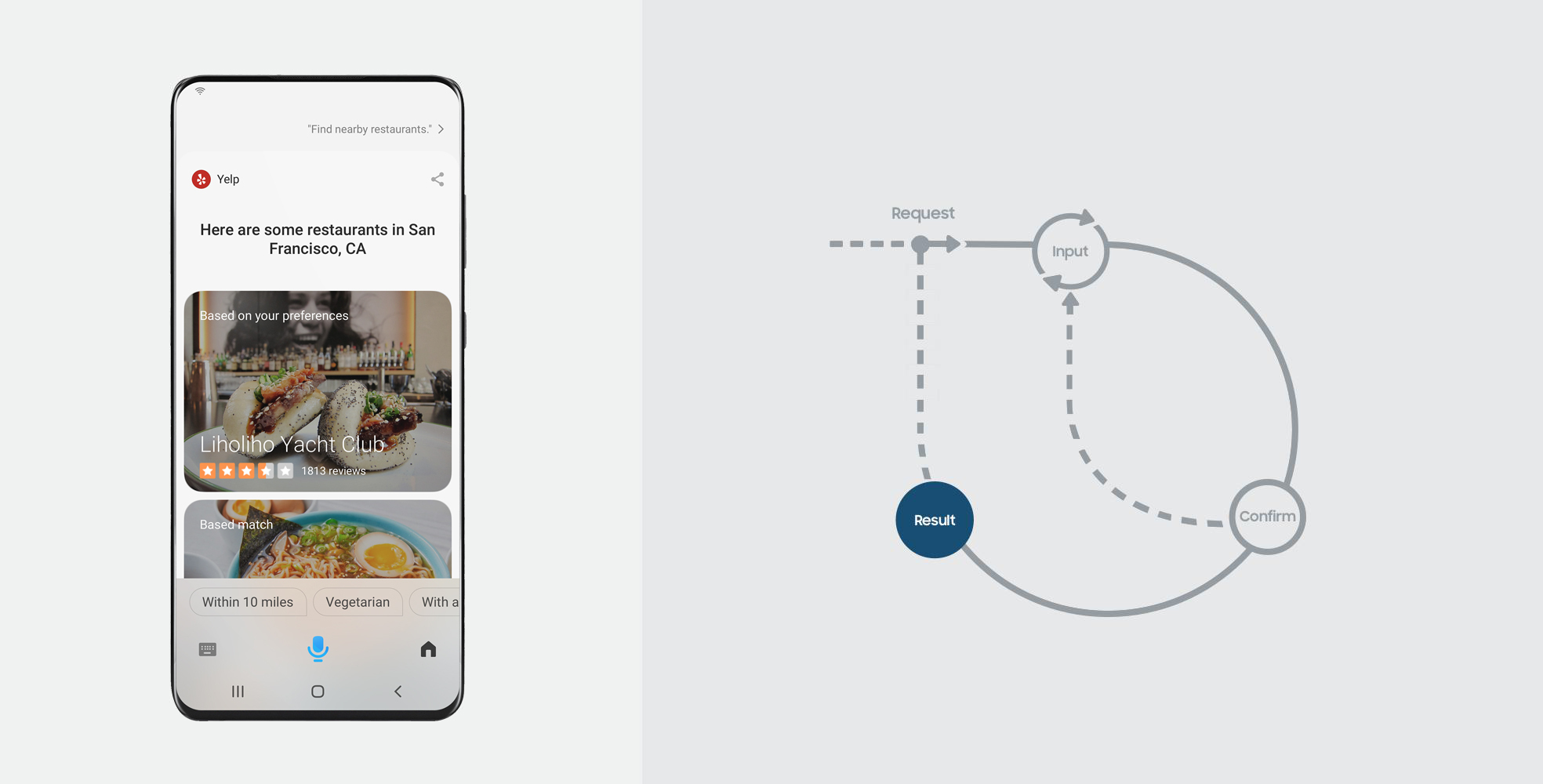
Bixby completes an action or presents information that delivers on the user’s goal in a Result Moment. It can be in the form of a list of results, a single result, or the receipt of a transaction.
Prior to a Result Moment, Bixby gathers all the information your service needs to fulfill a user’s intention (See Input Moment), and it has confirmed with the user if necessary (See Confirmation Moment). As an assistant, Bixby’s goal is always to accelerate the conversation leading up to results.
Here are some examples:
Here are some options.
These destinations look nice.
Your tour has been scheduled.
The conversation does not have to end after a Result Moment. Users can choose to move forward in one of the following ways:
Take action on the result. For instance saying, "Call Liholiho Yacht Club" or “Make a reservation at Liholiho Yacht Club” on restaurant results.
Follow-up with a related request. For instance asking, "When does Liholiho Yacht Club open?" on restaurant results.
Refine by adding or changing inputs. This will represent a new set of results, for instance saying, "Find me some cheaper options".
When to Use
Result moments are equally applicable while discovering choices, as they are while completing actions. Depending on where the user is in a conversation with Bixby, you can choose one of the following representations of the Result Moment:
Provide Choices when there are multiple results that match a user’s intention or request.
Provide Details when you can confidently narrow down to a single result that matches a user’s intention or request.
Provide a Receipt when the user’s request is complete.
This guide specifically discusses how to handle the Result Moment while in Bixby's interface. For policies on when to use app-launch to punch out to an application, see the App Punch Out Policies.
Key Considerations
Here are some important points to keep in mind when designing Result Moments:
Information Hierarchy
When providing choices, limit the number of distinct data points being shown on every summary to a maximum of four. This goes a long way in making the list scannable and readable.
Also, when providing choices, it’s important that the user understands what information is used to learn their preferences. These need to be shown to users on the summary.
When providing details, give a good overview while limiting the amount of information. Users can ask if they need more information.
Do not recreate the whole application or service interface by including all the available information. We don't recommend that you change the information hierarchy based on the user’s request. Therefore, it’s best to consider what is really important to a user when deciding between choices for all use cases.
Preference Learning
Factor in the user’s preferences while providing choices. This can be done by highlighting the top result based on a user’s preference and also ranking all results accordingly.
Provide Result Choices
You can stylize the list of choices you present to the user based on your use case.
List
A simple list is the most basic form of a list where content is presented as a flat list of choices to the user.
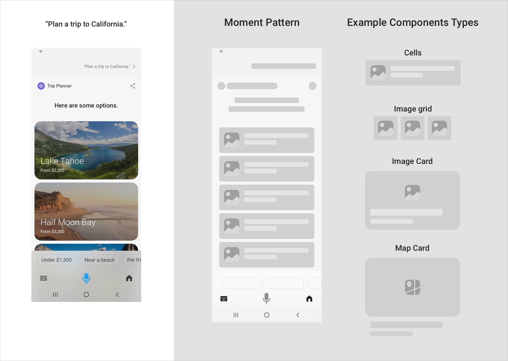
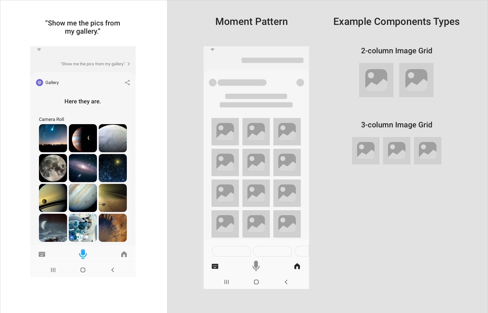
In the case of images, you can use a grid view which arranges your image content in a 2- or 3-column layout.
Here are some additional considerations when using a simple list:
Show only the most relevant information a user would need in order to make a choice. Since assistance is not a search experience ideally, it’s best to limit to 25 results.
If your service has curated content, a simple list is the best way to provide these choices to a user.
You can choose from a few different component options that best serves your content. This component is simply repeated in a scrollable list, and it will only ever be one type of component.
You can ensure that users stay within your capsule when making additional utterances by adding
conversation-drivers. To read more about capsule lock, see Capsule Lock and Modality.
List with Highlights
While providing choices, you should try to assist the user by highlighting some results. This can make it easier and faster for the user to make a decision.
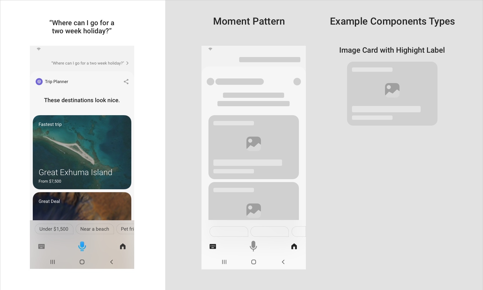
Here are some additional considerations when using a list with highlights:
The platform will display a maximum of three highlights in a list. Also, these highlights will only be visible if there are more than three results. And once highlights are applied, users have the option of seeing additional results.
Additional results are items that are grouped with a "More Results" label, and are shown right after the highlights.
You should keep highlights visually distinct from regular results. This can be achieved by using more prominent components for the highlights compared to other results.
Highlights come with a user-facing descriptive label that provides the reason for the highlight and differentiates it from other results. You should combine multiple criteria when highlighting something. For instance, when looking for flights, most users are looking for the lowest prices with the shortest duration, so highlighting "Cheap and Convenient" instead of just “Cheap Tickets” would make for a more useful highlight.
Since highlights are predetermined, the developer should exclude all of the highlights that operate over any of the inputs in a user’s request. For instance, it’s unnecessary to have a "Highly rated" highlight when a user requested “Top Italian restaurants nearby”. All choices should have good ratings.
Superlatives should not be used on highlight labels. For instance, use "Highly Rated" instead of “Highest Rated”.
Bixby can also often have a highlight "Based on your preferences". This is provided by the preference learning algorithms from the Bixby platform.
List With Header
Often when there is a hierarchical relationship within results (for instance, events by an artist, or rooms in a hotel), it helps to group these results under their parent result as a header. The parent component, as a header, is usually followed by a set of results presented in a simple list.
Here are some additional considerations when using a list with a header:
The nested items should use tappable components.
There can not be more than one level of nesting.
Use less prominent components for the nested items compared to the parent header component.
Provide Details on a Result
The Result Moment is also applied when providing more details on a single result. In all cases, the user arrives at a single result, either specifically asking for it or navigating to it from a list of choices.
Here are some additional considerations when providing details:
Details should always be in the form of sectioned content. Sectioning helps provide a quick overview of important information.
You should not display all the available information in every section, but instead snippets or examples that provide a flavor for every section. The user can ask for more detail if needed. Do not replicate an application or service.
Since the details have a lot of diverse information, it’s key to maintain a good information hierarchy by keeping important information at the very top.
The range of components that can be used in single Result Moment is diverse.
Details cannot contain any input components or buttons.
Any actions should be in the Action Zone at the bottom, as a primary action button or conversation drivers. In fact, it is encouraged to provide a primary action in the action zone that invites the user to take an action. For instance, in a hotel-booking scenario, the details of a hotel should have "Book hotel" as the primary action.
Provide a Resulting Receipt
A receipt is a type of Result Moment that is used to provide an endorsement that Bixby has successfully completed an action or transaction.
Here are some additional considerations when providing a receipt:
For monetary transactions, we recommend showing a detailed breakdown of the transaction amount.
The receipt should carry the summary of the transaction, consistent with the information from the Confirmation Moment. For more information, see After Commit Action Types in Transactional Workflows.
A receipt can also be leveraged when providing updates on an activity. For more information, see What Is Displayed in an Activity Card
Composition
This section describes how to compose the various parts for a Result Moment.
Conversation Zone
Bixby’s dialog in the Result Moment should be leveraged to provide a summary or commentary on the results shown in the content zone. For more information on how to write dialog, see the writing guidelines.
Content Zone
For more information on when to use these various components, see Designing With Bixby Views and Components and Layout Pattens. You can read more about these components in the Result View section on the Building Bixby Views page of the Developers' Guide or the reference pages linked below.
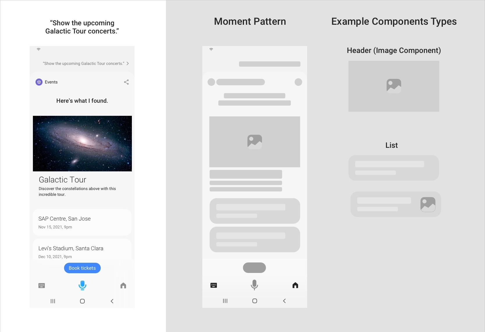
Components for Providing Choices
Use these components while providing choices:
- Image Card
- Compound Card, with one of these components:
- Thumbnail Card
- Cell Card
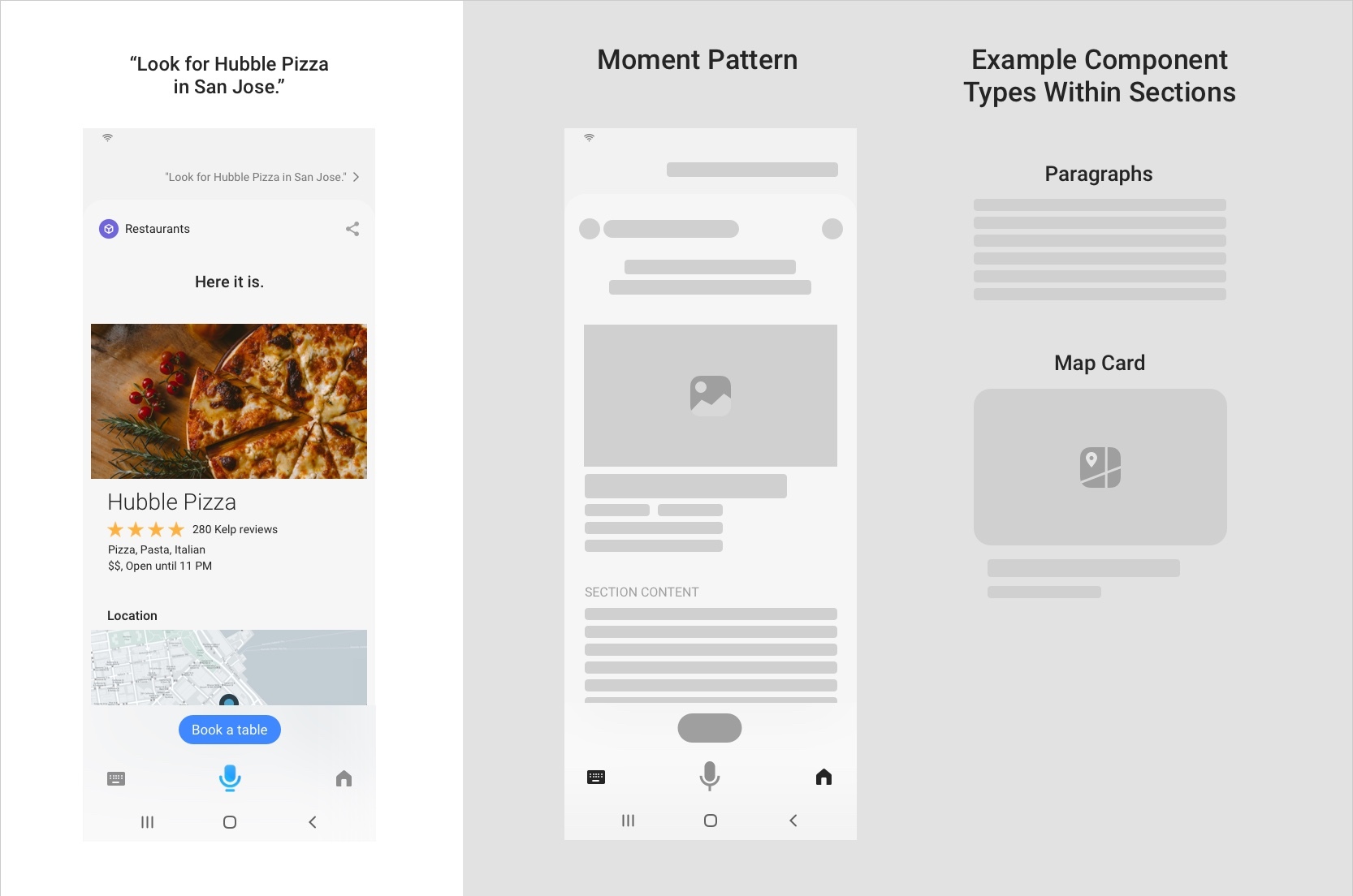
Components for Providing Details
Use these components while providing details:
- For Images:
- Single Line
- Paragraph
- Title Area, with one of these components:
- Hbox and vbox
- Partitioned
- Map Card
- Image Card
- Cell Card
- Thumbnail Card
If a component needs a link in the detail view, use a Compound Card.
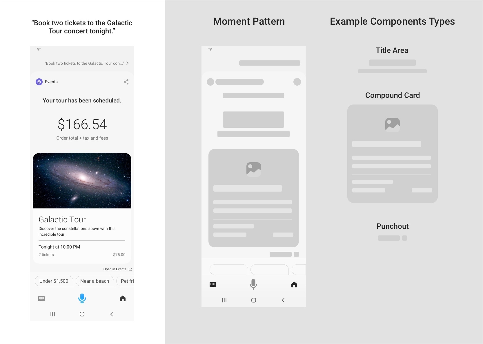
Components for Providing a Receipt
Use these components while providing a receipt:
- For total price, use a Title Area using
Centeralignment - If an image is needed, use an Image or a Compound Card. If using a compound card, use an Image Card as the main content and optionally with one of these components:
- For multiple items, use a partitioned container with these components:
Action Zone
Here are the various scenarios within an action zone:
Provide Choices
Since there are multiple choices being provided, the action zone should be leveraged to let the user quickly refine the results that are being shown. For example, on a generic request for flowers, you might want to have conversation drivers like "Birthday", "Anniversary", or "Under $50". Often, refinement options don’t make sense, so conversation drivers are not necessary.
Provide Details
The intention of the action zone in this case is to let the user quickly take action on the result being detailed. For instance, on a Hotel detail page, you might want to have conversation drivers to "Book Hotel", "Call the hotel", or "Get Directions". You could also include conversation drivers that let the user follow up with a related request, such as "Does it have a swimming pool?"
Provide a Receipt
The intention of the action zone in this case is to let the user do something that they would logically do next. For example, when playing a song on Spotify when you are on the receipt, it would be good to specify "Previous song" or "Next song" as a conversation driver.