
2019 July–September
Internal platform changes that are not visible to capsule developers will be communicated via internal status updates.
19P Capsule SDK Release Notes
Updated: September 10, 2019
New Limit on Store Sections
To ensure that capsules are more precisely targeted, you are now limited to two store-sections for each capsule.
capsule {
  ...
  store-sections {
    section (NewsAndMagazines)
    section (BusinessAndFinance)
  }
}
Deprecation Stages
Learn more about the deprecation stages.
- Stage 1: R19P
- Stage 2: R19Q
- End of Life: R19R
New Runtime Flag for Single Result in Input View
We've introduced a new runtime flag that changes how a single result is rendered within an input-view.
If you specify the use-input-views-for-selection-list-detail runtime flag, you can render the details of a single item in an input view by calling a layout, layout-match, or layout-macro.
Example
// With the `runtime-flag` enabled
input-view {
  match-pattern: MyResult (this)
  message (...)
  render {
    if (size(this) == 0) {
      // render a form
    } else-if (size(this) == 1) {
      layout {
        select-button-text (select me)
        section {
          ...
        }
      }
    } else {
      selection-of (this) {
        where-each (result) {
          ...
        }
      }
    }
  }
}
If not specified, then an input-view calls out to a corresponding result-view to render the layout for a single result when selecting an item from the selection list.
Deprecation Stages
Learn more about the deprecation stages.
- Stage 1: This deprecation is currently in Stage 1 and is safe to use until the time that we provide a formal deprecation schedule.
Changes to Automatic Decimal to Integer Conversation
Because there is a loss of precision, we no longer support automatically converting Decimal types to Integer. For example, if you have a macro that takes an Integer parameter, you can't pass in a Decimal.
You must either update the macro parameter to be a Decimal, or change the type being passed.
Deprecation Stages
Learn more about the deprecation stages.
- Stage 1: R19P
- Stage 2: R19Q
- End of Life: R19S
Changes to Size and Exists EL Special Operators
In an effort to further standardize Expression Language, we're deprecating the following EL special operators.
$size: Replace withsize(...)$exists: Replace withexists(...)
Deprecated
output (Recipe) {
   on-empty {
     if (servings.$exists) {
       drop (servings)
     } else-if (course.$exists || meal.$exists || cuisine.$exists) {
       ordered-effects {
         drop (course)
         drop (meal)
         drop (cuisine)
       }
     }
   }
 }
New
output (Recipe) {
   on-empty {
     if (exists(servings)) {
       drop (servings)
     } else-if (exists(course) || exists(meal) || exists(cuisine)) {
       ordered-effects {
         drop (course)
         drop (meal)
         drop (cuisine)
       }
     }
   }
 }
Deprecation Stages
Learn more about the deprecation stages.
- Stage 1: R20K
- Stage 2: R20N
- End of Life: None
Input Names Must be Alphanumeric
Your input names for an action now must use only alphanumeric characters (A-Z+a-z+0-9), with no dashes or special characters.
Deprecation Stages
Learn more about the deprecation stages.
- Stage 1: R19P
- Stage 2: R19R
- End of Life: R19T
Updates to Bixby-Provided Libraries
You must now explicitly import all Bixby-provided JavaScript libraries, such as console and http. For more information, see JavaScript API reference.
Deprecation Stages
Learn more about the deprecation stages.
- Stage 1: R19O
- Stage 2: R19P
- End of Life: R19V
MD5 Library Deprecated
We've deprecated the MD5 JavaScript library.
Deprecation Stages
Learn more about the deprecation stages.
- Stage 1: R19P
- Stage 2: R19Q
- End of Life: R19V
Three Deprecation EOLs Delayed
We're delaying the end-of-life for three deprecations until the 19U release:
- Aligned NL within Hints Deprecated
- Card Chin Deprecated
confirmed-byDeprecated
New Divider within Hbox Key
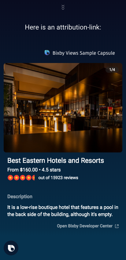
To allow for vertical separation, we've added a divider child key. This new key creates a dividing line between vbox components in a given hbox row.
hbox {
    content {
        vbox {
            content {
                single-line {
                    text {
                        value ("From #{value(hotel.lowRate)}")
                    }
                }
            }
        }
        divider
        vbox {
            content {
                single-line {
                    text {
                        value ("#{value(hotel.rating)} stars")
                    }
                }
            }
        }
    }
}
Here is how the vertical divider looks on mobile:

19O Capsule SDK Release Notes
Updated: August 19, 2019
The 19N release of Bixby Capsule SDK has been combined with 19O.
New Required Dispatch Phrases
We now require that your hints must use named dispatch. You can also add a preferred-hint to a hint, which can be used in situations where named dispatch is not required.
Example
hints {
  for-category (Translators) {
    hint ("Ask My Japanese Dictionary what is artificial intelligence in Japanese?") {
      preferred-hint ("What is artificial intelligence in Japanese?")
    }
    hint ("Ask My Japanese Dictionary what is alligator?") {
      preferred-hint ("What is alligator in Japanese?")
    }
    hint ("Ask My Japanese Dictionary what is crab?") {
      preferred-hint ("What is crab in Japanese?")
    }
    hint ("Ask My Japanese Dictionary what is the character for fire?") {
      preferred-hint ("What is the character for fire in Japanese?")
    }
  }
}
Deprecation Stages
Learn more about the deprecation stages.
- Stage 1: R19O
- Stage 2: R19Q
- End of Life: R19S
New Intent Key for Attribution Links
You can now add an intent key to the attribution-link. This allows you to add functionality such as triggering an additional result-view with an app-launch.
Example
...
  attribution-link {
    label ("a label")
    url ("a url")
    if (false) {
      url ("another url")
    } else {
      intent {
        goal: DoSomething
      }
    }
  }
Runtime Flag for New Input View
We've introduced a new runtime flag that changes how a single result is rendered within an input-view.
If you specify the use-input-views-for-selection-list-detail runtime flag, you can render the details of a single item in an input view by calling a layout, layout-match, or layout-macro.
Example
// With the `runtime-flag` enabled
input-view {
  match-pattern: MyResult (this)
  message (...)
  render {
    if (size(this) == 0) {
      // render a form
    } else-if (size(this) == 1) {
      layout {
        select-button-text (select me)
        section {
          ...
        }
      }
    } else {
      selection-of (this) {
        where-each (result) {
          ...
        }
      }
    }
  }
}
If not specified, then an input-view calls out to a corresponding result-view to render the layout for a single result when selecting an item from the selection list.
Deprecation Stages
Learn more about the deprecation stages.
- Stage 1: This deprecation is currently in Stage 1 and is safe to use until the time that we provide a formal deprecation schedule.
New Runtime Flag to Disable Input Filtering
We've added a new runtime flag, no-filtering-with-validation, which changes how Bixby applies validation conditions in order to reduce the number of ambiguous values.
By default, when a cardinality constraint violation occurs because an input has too many available candidates, Bixby attempts to pre-filter the available candidates using the existing input validations. This runtime flag disables that.
For more information, see Runtime Flags.
Example
capsule {
  ...
  runtime-flags {
    concepts-inherit-super-type-features
    modern-prompt-rejection
    support-halt-effect-in-computed-inputs
    no-filtering-with-validation
  }
}
Deprecation Stages
Learn more about the deprecation stages.
- Stage 1: R19N
- Stage 2: R19O
- End of Life: R19P
Updates to Hints and Endpoints File Naming
You now have the option to name your hints and endpoints files without a prefix.
Allowed:
my.hints.bxbmy.endpoints.bxbhints.bxbendpoints.bxb
Not Allowed:
shints.bxbmyendpoints.bxb.hints.bxb.endpoints.bxb
Status Bar within Transaction Support Deprecated
We've added a new runtime flag, no-filtering-with-validation, which changes how Bixby applies validation conditions in order to reduce the number of ambiguous values.
By default, when a cardinality constraint violation occurs because an input has too many available candidates, Bixby attempts to pre-filter the available candidates using the existing input validations. This runtime flag disables that.
For more information, see Runtime Flags.
Example
capsule {
  ...
  runtime-flags {
    concepts-inherit-super-type-features
    modern-prompt-rejection
    support-halt-effect-in-computed-inputs
    no-filtering-with-validation
  }
}
Deprecation Stages
Learn more about the deprecation stages.
- Stage 1: R19N
- Stage 2: R19O
- End of Life: R19P
Prompt Mode Deprecated
Because most capsules currently use the default mode of replace, we've deprecated the mode key within prompt.
Old:
...
  error (MultipleItemsMatched) {
    property (candidates) {
      type (FoodName)
      min (Required)
      max (Many)
    }
    on-catch {
      prompt (menuItemName) {
        min (1)
        max (1)
        mode (Replace)
        candidates (candidates)
      }
    }
  }
...
Deprecation Stages
Learn more about the deprecation stages.
- Stage 1: R19N
- Stage 2: R19O
- End of Life: R19P
19M Capsule SDK Release Notes
Updated: July 26, 2019
New Runtime Flag for Validation
We've added a new runtime flag, no-filtering-with-validation, which changes how Bixby applies validation conditions in order to reduce the number of ambiguous values.
By default, when a cardinality constraint violation occurs because an input has too many available candidates, Bixby attempts to pre-filter the available candidates using the existing input validations. This runtime flag disables that.
For more information, see Runtime Flags.
Example
capsule {
  ...
  runtime-flags {
    concepts-inherit-super-type-features
    modern-prompt-rejection
    support-halt-effect-in-computed-inputs
    no-filtering-with-validation
  }
}
Deprecation Stages
Learn more about the deprecation stages.
- Stage 1: R19N
- Stage 2: R19O
- End of Life: R19P
New Runtime Flag for Default View Behavior
We've introduced a new runtime flag, modern-default-view-behavior, which changes behavior when a result view or input view is not defined.
If modern-default-view-behavior is not set, Bixby will fall back to a default collection. This behavior is deprecated, and will be removed in a future release.
Example
capsule {
  ...
  runtime-flags {
    concepts-inherit-super-type-features
    modern-default-view-behavior
    support-halt-effect-in-computed-inputs
  }
}
Meta Command Updates
We've added a number of reserved utterances. Read Reserved Utterances for the full list.
Bixby Views Updates
Default Views
If you include the new modern-default-view-behavior runtime flag, any Bixby Views you create now have default views if you do not specify a result-view or an input-view that matches the current moment. Bixby uses a default view that can provide a reasonable display of results or selectable options to the user. Your capsule should provide its own views for the best possible conversations with users.
There is no default confirmation-view, although Bixby falls back to default confirmation dialog and displays if views are not defined for confirmation moments.
For more information, see Runtime Flags.
Deprecation Stages
Learn more about the deprecation stages.
- Stage 1: R19O
- Stage 2: R19S
- End of Life: R19Y
Manual Page Navigation
We've introduced a new read-manual key within navigation-mode, which provides you with a manual way to handle page navigation. Results still have paging, but you have more control over how this is done. This key helps you with APIs that handle result paging themselves. For example, you might use this with a web API that provides a "cursor" to obtain more results, rather than returning all results.
Example
result-view {
  match-pattern: MyResultList (list)
  render {
  list-of (list.results) {
    navigation-mode {
      read-manual {
        page-selection-question (Do you like one of these?)
        item-selection-question (Which one would you like?)
        previous-page {
          intent {
            goal: MyResultList
            value: MyPageNumber$expr(list.curPage - 1)
          }
        }
        next-page {
          intent {
            goal: MyResultList
            value: MyPageNumber$expr(list.curPage + 1)
          }
        }
        // optional
        with-previous-page-conversation-driver (!list.isFirstPage)
        with-next-page-conversation-driver (!list.isLastPage)
      }
    }
  }
}
New Progress Bar Component
We've added a new progress-bar component to let users know the progress of an event or action.
Example
  section {
    content {
      progress-bar (70.2)
    }
    ...
  }
New Column Size Key for Image Cards
We've added a new column-size key, which determines how many image cards are displayed within a larger list. You can specify 1, 2, or 3 cards per column.
Example
list-of (this) {
    where-each (car) {
        compound-card {
            content {
                image-card {
                aspect-ratio (9:16)
                column-size (2)
                image-url ("#{raw(car.imageUrl)}")
                title-area {
                    slot1 {
                        text {
                            value ("#{raw(car.name)}")
                            style (Title_M)
                        }
                    }
                }
                }
            }
        }
    }
}
New Color Option in Text
You now have the option to specify amber, blue, green, or red text color within text. If not specified, the default color is white.
19L Capsule SDK Release Notes
Updated: July 8, 2019
Layouts within Layout Macros
You can now add a layout within layout-macro.
You can't use a layout-macro with list-of and selection-of components if the macro can return a layout.
Updates to Geo Library Capsule
The NamedPoint concept within the viv.geo library capsule now supports rectangular bounding boxes.
Bixby Views Updates
Chin Deprecated within Compound Card
We're making Bixby Views more consistent by ensuring each card has only one tappable area. As a result, we're deprecating support for the chin key for compound-card.
For more information, see cards in Bixby Views.
Deprecation Stages
Learn more about the deprecation stages.
- Stage 1: R19M
- Stage 2: R19O
- End of Life: R19U
New Attribution Link within Sections
We've added the ability to add an attribution-link within sections.
Example
// Within a larger view or layout file
section {
    content {
        ... //other components
        attribution-link {
            label {
                template ("More on BixbyDevelopers.com")
            }
            url ("https://bixbydevelopers.com")
        }
    }
}
New Spacer within Section Content
We've added the option to add spacer in content within a section.
// within a larger Views file
...
section {
  content {
    title-area { ... }
    spacer // 24px
    paragraph { ... }
    // no spacer, 12px space between these two components
    single-line { ... }
  }
}
...
New Date Interval for Calendar Picker
In addition to a single date, you can now use viv.time.DateInterval as the initial-value for a calendar picker.
New 'flattenAs' Expression Function
We've introduced a new flattenAs formatting expression function, which flattens specified nodes into a single list, formats them in the specified format, then joins those formatted strings as a conjunctive list ("value1, value2, and value3").
Updates to Deprecation Lifecycle
We've updated our SDK deprecation lifecycle, which includes three stages. Learn about these deprecations in our Developers' Guide.
'confirmed-by' Deprecated
We've deprecated the confirmed-by key. You should instead use the confirm key.
Example
confirm {
  if (myInput > 65) {
    by (MyConfirmation)
  }
}
Deprecation Stages
Learn more about the deprecation stages.
- Stage 1: R19L
- Stage 2: R19O
- End of Life: R19U
Old File Extensions Deprecated
- 19P Capsule SDK Release Notes
- New Limit on Store Sections
- Deprecation Stages
- New Runtime Flag for Single Result in Input View
- Deprecation Stages
- Changes to Automatic Decimal to Integer Conversation
- Deprecation Stages
- Changes to Size and Exists EL Special Operators
- Deprecation Stages
- Input Names Must be Alphanumeric
- Deprecation Stages
- Updates to Bixby-Provided Libraries
- Deprecation Stages
- MD5 Library Deprecated
- Deprecation Stages
- Three Deprecation EOLs Delayed
- New Divider within Hbox Key
- 19O Capsule SDK Release Notes
- New Required Dispatch Phrases
- Deprecation Stages
- New Intent Key for Attribution Links
- Runtime Flag for New Input View
- Deprecation Stages
- New Runtime Flag to Disable Input Filtering
- Deprecation Stages
- Updates to Hints and Endpoints File Naming
- Status Bar within Transaction Support Deprecated
- Deprecation Stages
- Prompt Mode Deprecated
- Deprecation Stages
- 19M Capsule SDK Release Notes
- 19L Capsule SDK Release Notes