
Layout Patterns
This guide describes visual design tips and further explanations on why certain layout patterns are ideal for various situations.
For more information on the various child keys used within the code sample, such as the image-object-fit key for an image in a thumbnail card, see the reference pages for the components listed in this document. For more information on component specifications, especially for design purposes, see Designing Components.
Multiple Results
Multiple results require a list of cards. There are several different styles of Cards from our component library. Find the best card that fits the information hierarchy of your capsule. The following table lists examples of cards you can use.
| Image Card | Thumbnail Card | Title Card | Cell Card | Compound Card |
|---|---|---|---|---|
 | 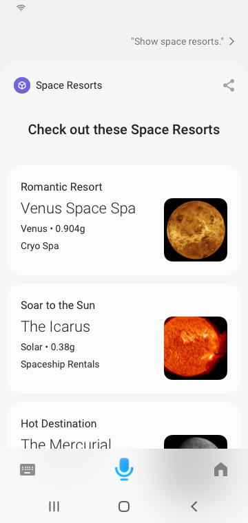 | 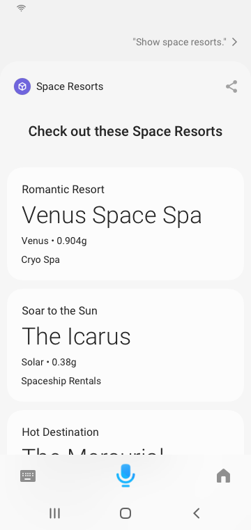 | 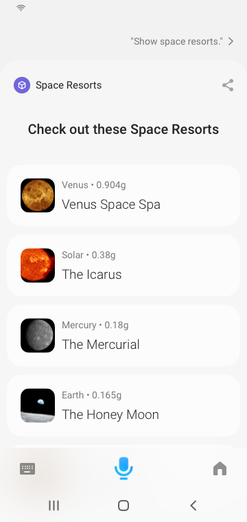 |  |
Single Result
This section discusses the various types of single result layouts that you might need to use. You should display a single result in the following situations:
- A user taps on an item in a result list to see more details of that item. See Details Layout.
- There's only a single result returned from a user request, and you've reached a "Done" moment. See Done Moment Layout.
- You're providing a receipt from a transaction. See Receipt Layout.
This single result layout is also sometimes called a "Details View".
Details Layout
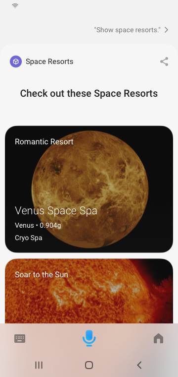
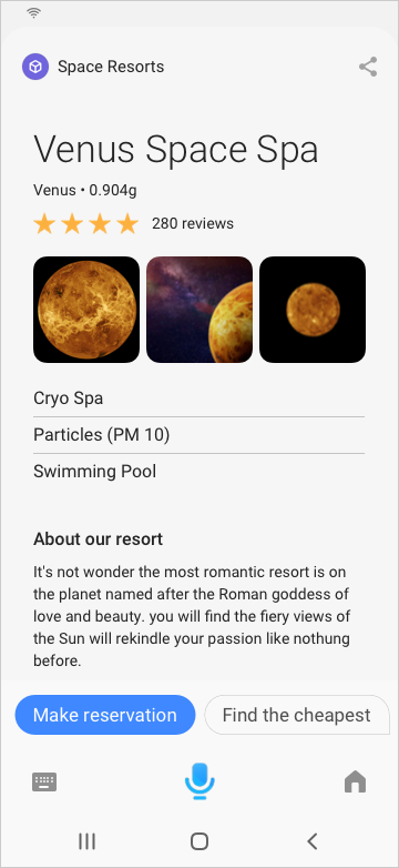
A details layout shows the details of a particular item. For space resorts, that might be the details of a specific space resort.
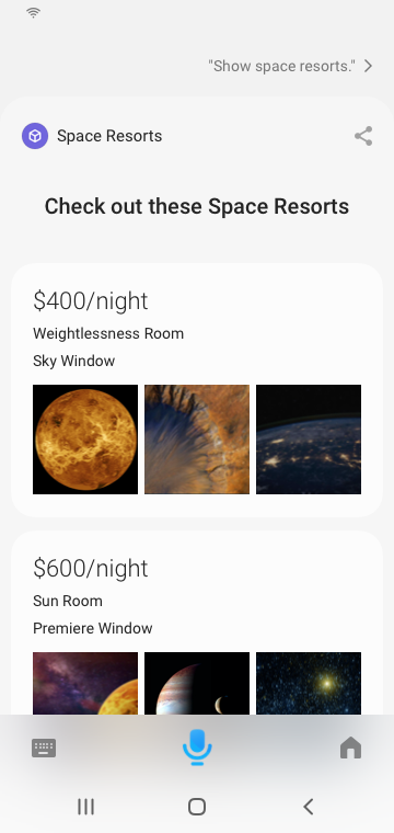
If images are a top priority piece of information, use an image-carousel at the very top of your layout.
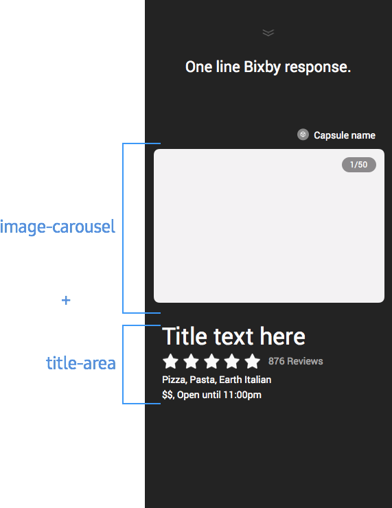
Images are useful to see details of your product, which can further help the user make a decision. Other examples might include hotel rooms or restaurant interiors. Use beautiful high-resolution images to make a dynamic impact, such as artist posters, delicious food, close-ups of your product, or nature imagery.
Within space resorts, here is a full example:
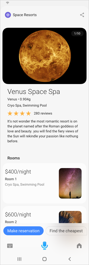
This layout uses these components:
image-carouseltitle-areasingle-line(Uses both an icon and a text inline.)paragraphthumbnail-cardin a separatesection(This lists the rooms.)
Here is the code:
//header
section {
    content{
        image-card {
            text-position (Below)
            image-background-color (White)
            image-object-fit (Contain)
            aspect-ratio (16:9)
            image-url {
                template ("images/planet.jpg")
            }
            title-area {
                halign (Start)
                slot1 {
                    text {
                        value {
                            template ("Venus Space Spa")
                        }
                    }
                }
                slot2 {
                    paragraph {
                        value {
                            template ("Venus • 0.904g")
                        }
                    }
                }
                slot3 {
                    paragraph {
                        value {
                            template ("Cryo Spa | Swimming Pool")
                        }
                    }
                }
            }
        }
        single-line {
            image {
                url {
                    template ("images/starRating.png")
                }
            }
            text {
                value {
                    template ("(280 reviews)")
                }
            }
        }
    }
}

// Rooms list
section {
    title{
        template("Rooms")
    }
    content {
        for-each (roomList) {
            as (room){
                thumbnail-card {
                    image-aspect-ratio (9:16)
                    image-object-fit (Cover)
                    image-position (End)
                    image-url {
                        template ("images/planet.png")
                    }
                    title-area {
                        halign (Start)
                        slot1 {
                            text {
                                value {
                                    template ("#{value (room.price)}")
                                }
                            }
                        }
                        slot2 {
                            paragraph {
                                value {
                                    template ("Room #{i}")
                                }
                            }
                        }
                        slot3 {
                            paragraph {
                                value {
                                    template ("Cryo Spa | Swimming Pool")
                                }
                            }
                        }
                    }
                }
            }
        }
    }
}
If image aren't a top priority, you can still make a bold design with text.
Using large images is not the only way to make the design bold. Use larger text in slot1 of a title-area to make the design more impactful. As a best practice, you can add an image-list under a nice title in your layout. The image list can mask and show three images. If you use this layout with compound-card, you can create a customized card.
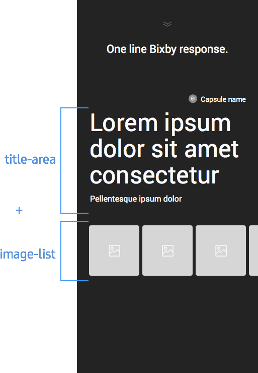
Within space resorts, here is a full example:
This layout uses these components:
title-area(Inslot1, the text style is set toTitle_L, whileslot2has text style set toDetail_L.)single-line(Uses both an icon and a text inline, with the style set toDetail_L)image-listpartitionedparagraphin a separatesection(This lists the rooms)
Here is the code:
section {
    content{
    title-area {
        halign (Start)
        slot1 {
            text {
                value {
                    template ("Venus Space Spa")
                }
                style (Title_L)
            }
        }
        slot2 {
            paragraph {
                value {
                t   emplate ("Venus • 0.904g")
                }
                style (Detail_L)
            }
        }
        slot3 {
            single-line {
                image {
                    url {
                        template ("images/starRating.png")
                    }
                    style (Detail_L)
                }
                text {
                    value {
                        template ("(280 reviews)")
                    }
                    style (Detail_L)
                }
            }
        }
    }
    image-list {
        images (resort.images)
    }
    partitioned {
        content {
        for-each (resort.features) {
            as (feature) {
            paragraph {
                value {
                template ("#{value (feature.description)}")
                }
            }
            }
        }
        }
    }
    }
}
section {
    title{
        template("About our resort")
    }
    content {
        paragraph {
            value {
                template ("#{value (resort.description)}")
            }
        }
    }
}
Done Moment Layout
If you are confirming that an action has been completed and you don't need a receipt, you can create a simple layout to indicate to the user a Done Moment, which is the simplest result view you can create.
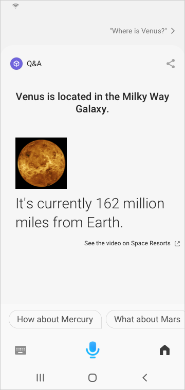
This layout uses these components:
single-line(Uses just an image inTitle_XXL)paragraph(Uses aTitle_Mtext style)attribution-link(Allows users to punch out, in case they want more information)
Here is the code:
single-line {
image {
url {
template ("images/planet.png")
}
}
}
paragraph {
value {
template ("It is currently....")
}
style (Title_M)
}
attribution-link {
label {
template ("More on CP name")
}
url ("https://bixbydevelopers.com/dev/docs/sample-capsules/walkthroughs/space-resorts")
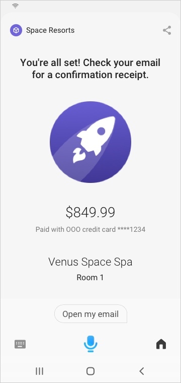
}Receipt Layout
This layout is useful for a "done" moment after completing a transactional workflow, such as a purchase.
Inputs
When gathering input from a user, there are several ways to set up your input view.
- If you need information from the user, you can use one of the pickers.
- If you want to just provide the user a selection of items to choose from, tailor the selection layout.
- If you need to have a user provide an answer after eliciting a response, you can use elicitation components in an input view.
Selection Layouts
Selection layouts are made using the selection-of key in the input view. Within this list, you should use a card. For more information on the specific cards within a selection layout, see Selection Components.
Confirmations
There are many options to use in a Confirmation Moment, but the key points are this:
- For non-interactive components, namely for information that users can't edit at that time, use one of the following:
- For text:
cell-cardwithout anon-click,title-area,single-line,partitioned - For images:
image,single-line - For layouts:
section,hboxandvbox
- For text:
- For interactive components, namely so that users can select and change an option at this stage, use cards or tappable cells
- For listed options:
image-card,thumbnail-card,title-card,cell-card,compound-card - For other fields:
input-cellorsplit-input-cell
- For listed options:
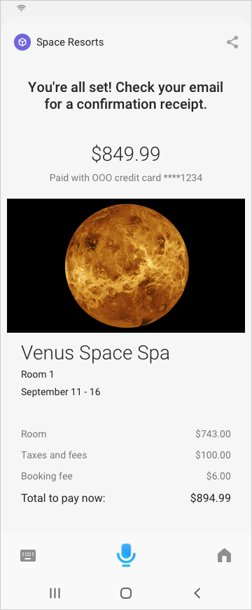
Within space resorts, here is a full example:
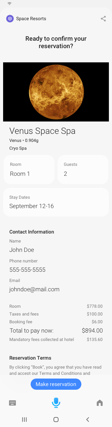
This layout uses these components:
image-cardsplit-input-cellandinput-cellhboxwith severalvboxcomponents (Using the text styleDetail_M_Softfor most items, except for the line you want to stand out ("Total to pay now:"), which uses the text styleDetail_L)single-lineparagraph(UsingLegalas the text style)
Here is the code:
section {
    content{
        image-card {
            text-position (Below)
            image-background-color (White)
            image-object-fit (Contain)
            aspect-ratio (16:9)
            image-url {
                template ("images/planet.jpg")
            }
            title-area {
                halign (Start)
                slot1 {
                    text {
                        value {
                            template ("Venus Space Spa")
                        }
                    }
                }
                slot2 {
                    paragraph {
                        value {
                            template ("Venus • 0.904g")
                        }
                    }
                }
                slot3 {
                    paragraph {
                        value {
                            template ("Cryo Spa | Swimming Pool")
                        }
                    }
                }
            }
        }
        split-input-cell {
            left {
                input-cell {
                    label {
                        template ("Room")
                    }
                    value {
                        template ("Room 1")
                    }
                }
            }
            right {
                input-cell {
                    label {
                        template ("Guests")
                    }
                    value {
                        template ("2")
                    }
                }
            }
        }
        input-cell {
            label {
                template ("Stay Dates")
            }
            value {
                template ("September 11 - 16")
            }
        }
    }
}

section {
    title {
        template ("Contact Information")
    }
    content {
        input-cell {
            label {
                template ("Name")
            }
            value {
                template ("[#{value(cart.event.boxOffice.recipient.firstName)}][ #{value(cart.event.boxOffice.recipient.lastName)}]")
            }
        }
        input-cell {
            label {
                template ("Phone number")
            }
            value {
                template ("[#{value(cart.event.boxOffice.recipient.phoneNumber)}]")
            }
        }
        input-cell {
            label {
                template ("Email")
            }
            value {
                template ("[#{value(cart.event.boxOffice.recipient.emailAddress)}]")
            }
        }
    }
}

section {
    content{
        hbox {
            content {
                vbox {
                    halign (Start)
                    content {
                        text {
                            value {
                                template ("Room")
                            }
                            style (Detail_M_Soft)
                        }
                        text {
                            value {
                                template ("Taxes and Fees")
                            }
                            style (Detail_M_Soft)
                        }
                        text {
                            value {
                                template ("Booking Fee")
                            }
                            style (Detail_M_Soft)
                        }
                        text {
                            value {
                                template ("Total to pay now:")
                            }
                            style (Detail_L)
                        }
                        text {
                            value {
                                template ("Mandatory fees collected at hotel")
                            }
                            style (Detail_M_Soft)
                        }
                    }
                }
                vbox {
                    halign (End)
                    content {
                        text {
                            value {
                                template ("[#{value (cost.room)}]")
                            }
                            style (Detail_M_Soft)
                        }
                        text {
                            value {
                                template ("[#{value (cost.fee)}]")
                            }
                            style (Detail_M_Soft)
                        }
                        text {
                            value {
                                template ("[#{value (cost.booking)}]")
                            }
                            style (Detail_M_Soft)
                        }
                        text {
                            value {
                                template ("[#{value (cost.grandTotal)}]")
                            }
                            style (Detail_L)
                        }
                        text {
                            value {
                                template ("[#{value (cost.feeAtHotel)}]")
                            }
                            style (Detail_M_Soft)
                        }
                    }
                }
            }
        }
    }
}

section {
    title{
        template("Reservation Terms")
    }
    content{
        paragraph{
            value {
                template ("#{value (terms)}")
            }
            style (Legal)
        }
    }
}