Designing With Bixby Views
Bixby lets you construct views to build your capsule's user interface. Bixby Views uses the same language as Bixby's models. By using Views, you can create interactive designs for Bixby in a simple, consistent manner. Views render the content of Moments in a Bixby conversation.
Bixby capsules on mobile devices use OneUI's Flexible UX. See Design Considerations for Flexible UX for details and and tips on how to best take advantage of Flexible UX views, particularly if you are working with an older capsule that has not been updated with Flexible UX in mind. For information on the layout patterns within these examples, see Layout Patterns. For information on how to design for other devices and for hands-free mode, see Hands-Free and Multiple Devices Design Guide.
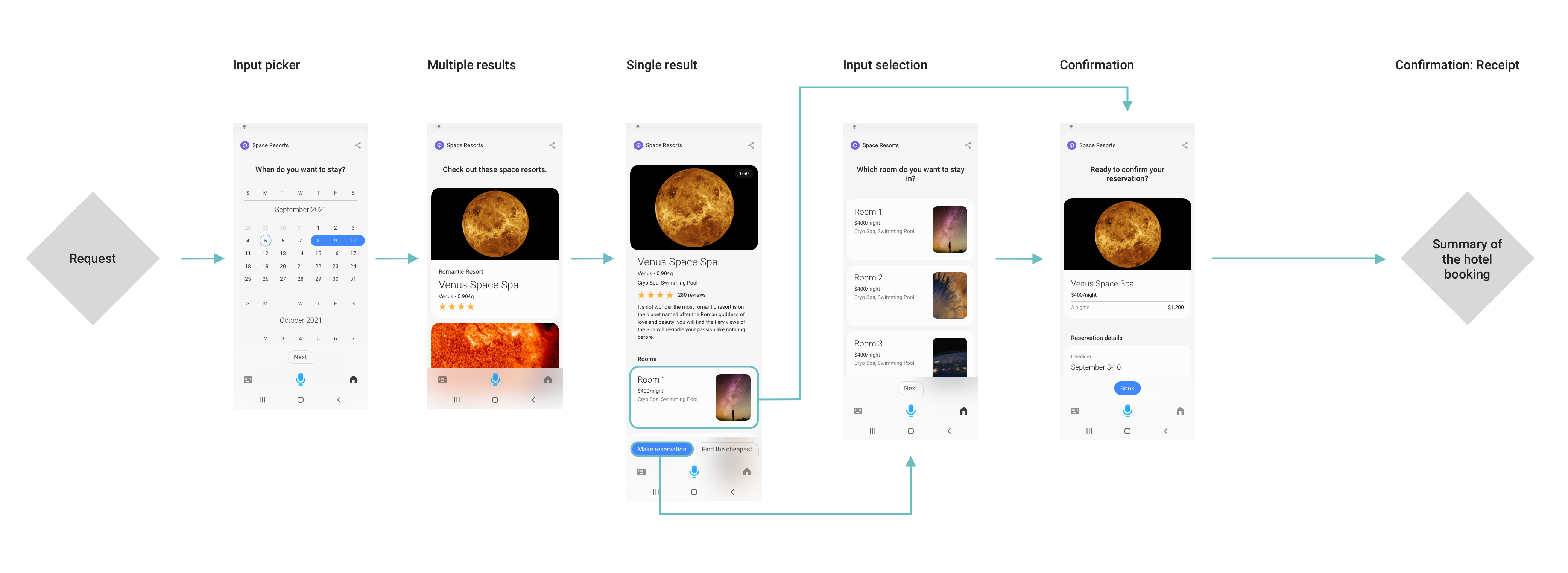
Space Resorts Example
Let's walk through the Bixby Views design system with the Space Resorts sample capsule. In this capsule, users can book hotel rooms on different planets. You can consider this a case study to follow while designing your own capsules.
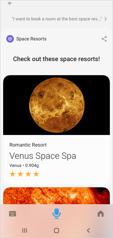
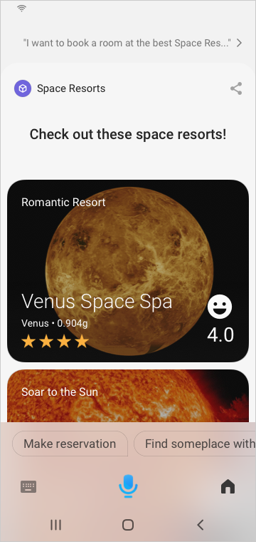
User: "I want to book a room at the best Space Resort in the Galaxy."
Bixby: Check out these space resorts!
Step 1: Define Your Business Goal
The Space Resorts capsule allows users to browse and reserve rooms (or HabitatPods) through the Space Resorts service, using Bixby from their Samsung device.
Space Resort’s business goal is to get users to browse and book these HabitatPods. With that in mind, your team designer and project manager can decide on a few must-work use cases:
- Book a hotel room on your favorite planet which has a space spa amenity
- Cancel your recently booked Space Resort on Jupiter
- Check the status of a recent Space Resorts booking
- Search for cool new Space Resorts on Pluto for Canada Day weekend at a rate of less than $500/night
You can learn more about defining must-work use cases in the Planning a Capsule guide.
Step 2: Create the Main Flows
Based on the must-work use cases you define in Step 1, think of four to eight main user flows. Make sure that the user can complete the task in the most efficient way possible.
For example, consider the flow of must-work use case 1: Book a hotel room on your favorite planet that has a spa amenity.
User: "Book a Space Resort that has a spa."
You can also refer to the Designing Conversations guides to help you understand which flows to use.
Step 3: Write Bixby's Dialog
Based on the must-work use cases, think about the actual dialog Bixby will say to users during these conversations.
User: "Book a Space Resort that has a spa."
For guidance on how to write the best dialog for your capsule, see Writing Dialog in the Design Guides. For more information how to implement dialog, see Refining Dialog in the Developers' Guides.
Step 4: Define the Information Hierarchy
Your capsule should provide curated content with the most valuable results from the user's request.
Next, define the information hierarchy, based on the must-work use cases.
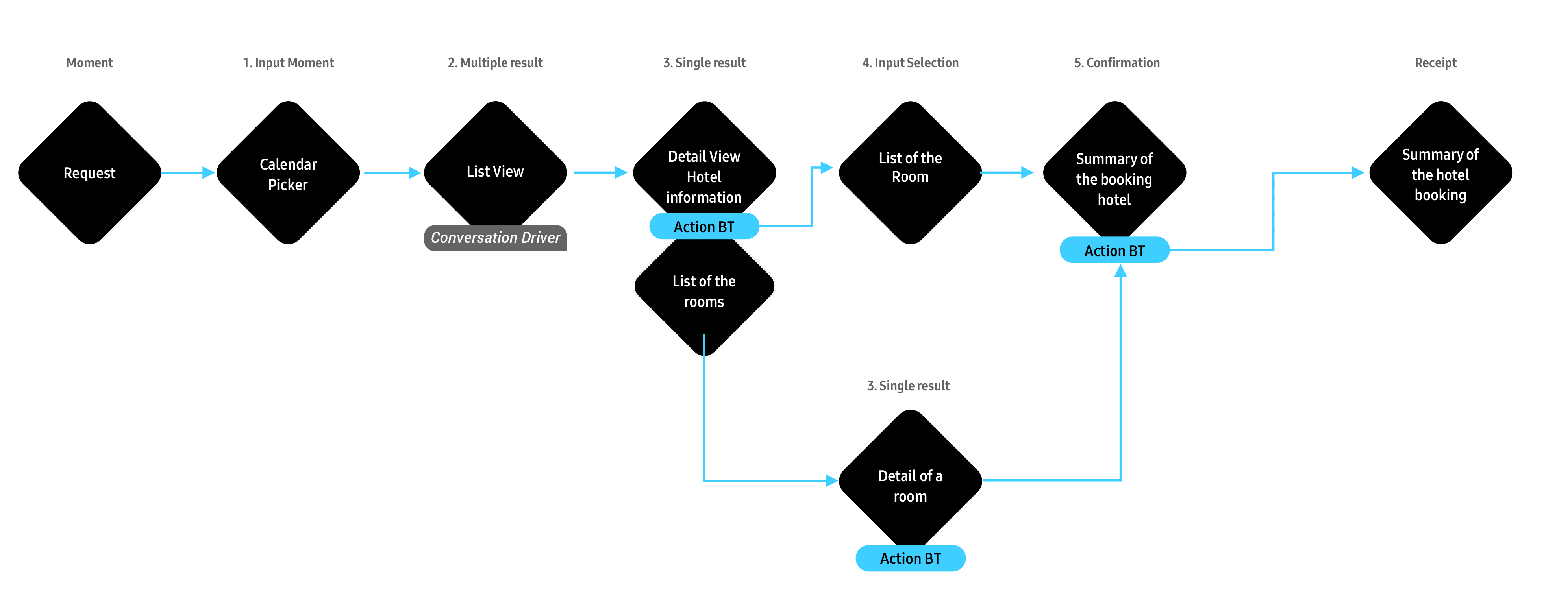
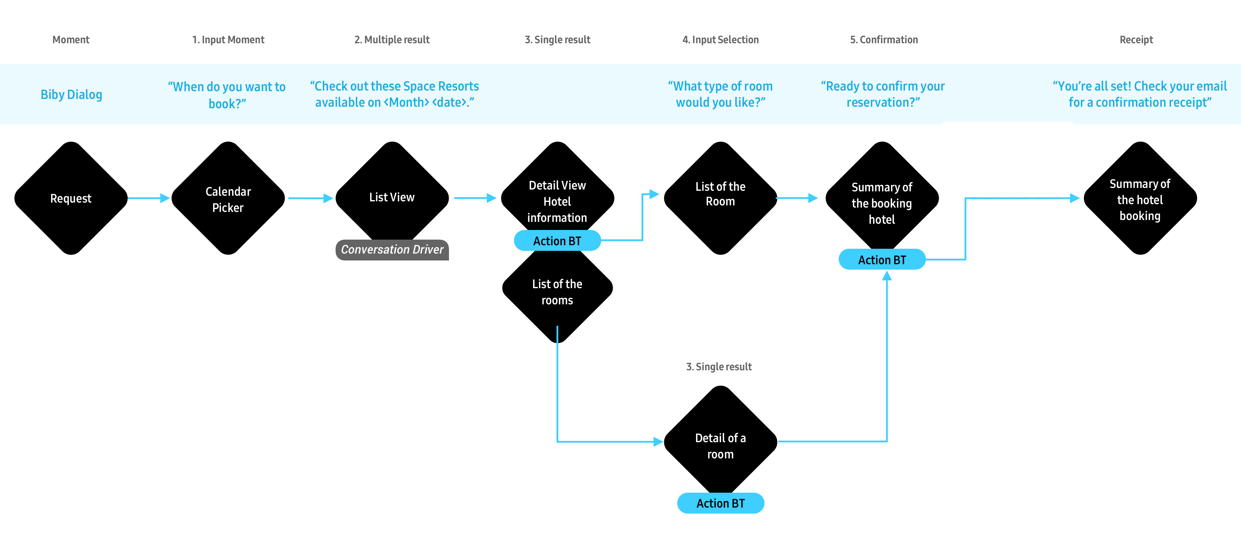
Multiple Results
Show a summary of the result concept, selecting the top three to five priority pieces of information:
- Priority 1: Provide a high-res image to show nice resort pictures.
- Priority 2: Resort name
- Priority 3: Location and any services provided
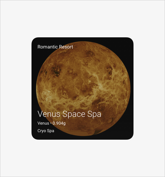
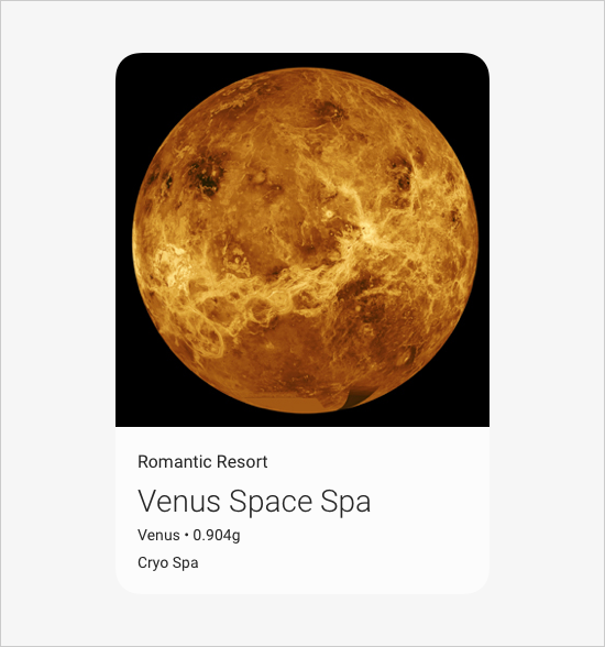
A Single Result
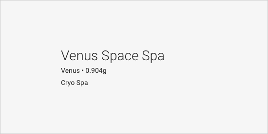
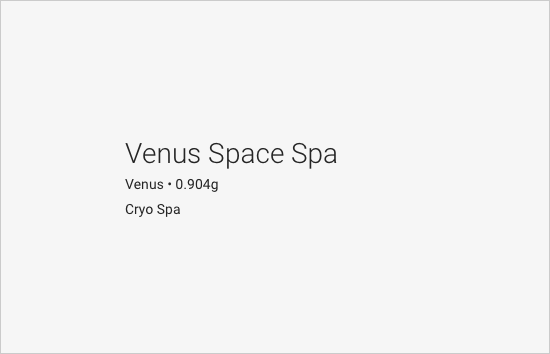
You want to show high-resolution images of the available space resorts. To understand the selling points of each resort, give a short summary of each resort in a description. There are a lot of amenities, but you should show the top 3 selling points. For the Space Resorts capsule, you should also show room information as a detail view to help users learn more.
- Priority 1: Provide more images
- Priority 2: Resort name and secondary information
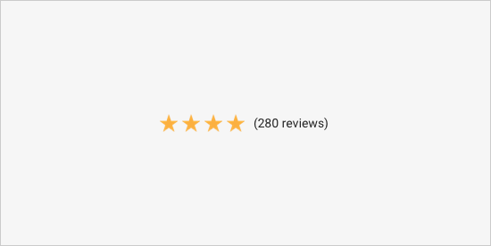
- Priority 3: Ratings and review count
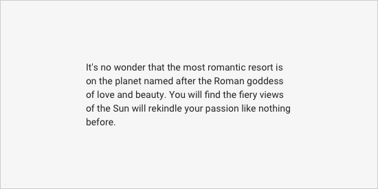
- Priority 4: Hotel description (max 5 lines)
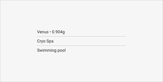
- Priority 5: Amenities
- Priority 6: Room information
Inputs
For inputs, you want to consider which information you need to display for the user to book a room.
- Priority 1: Price per room
- Priority 2: Room name
- Priority 3: Room images
- Priority 4: Special offer
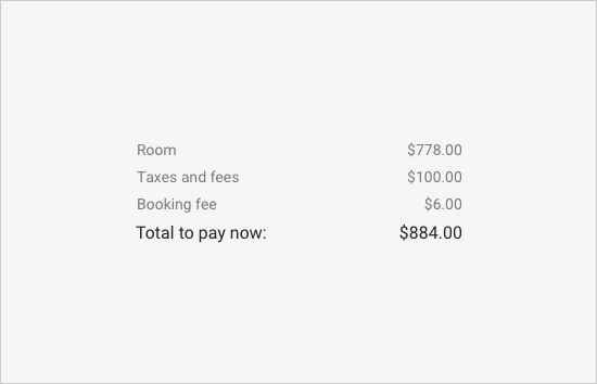
Confirmations
You will also need to confirm the details of a user’s choices.
- Priority 1: Check-in check-out time
- Priority 2: Choice of room
- Priority 3: Contact information (name, phone number and email address)
- Priority 4: Total price
Step 5: Find the Best Components for Each Moment
For more information on each of these components and why they are useful for these Moments, see Components and Layout Patterns.
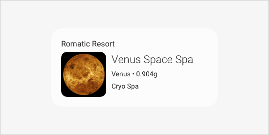
For Multiple Results
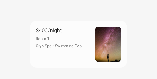
You can use an image-card or a thumbnail-card to cover all three of these priorities.
Priority 1: Provide a high-res image to show nice resort pictures.
Priority 2: Resort name
Priority 3: Location and any services provided
The following table shows some examples.
image-card with text position Overlay | image-card with text position Below | thumbnail-card with image on left |
|---|---|---|
 |  |  |
Here are more examples:

For a Single Result
Within a larger layout, you can use the following components to cover the different priorities, which you can see in these tables:
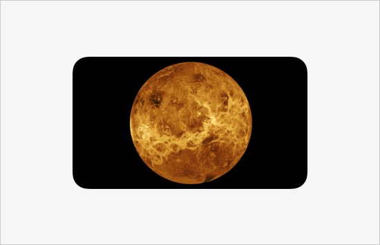
Priority 1: Provide more images
image-carousel | image-list |
|---|---|
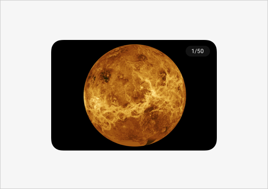 | 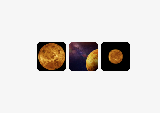 |
Here are more examples:
Priority 2, 3, and 4: Resort name and Secondary information, Ratings and review count, and Description
title-area | single-line | paragraph |
|---|---|---|
 |  |  |
Here are more examples:
Priority 5: Top 3 Amenities
partitioned | single-line |
|---|---|
 |  |
Here are more examples:
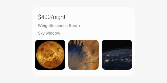
Priority 6: Room information and options
thumbnail-card with image on right | thumbnail-card with image on left |
|---|---|
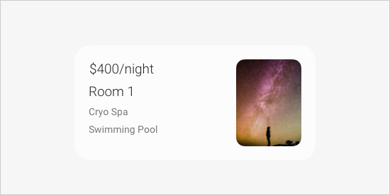 | 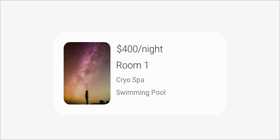 |
Here are more examples:
For Input
To have users choose a room to stay in, provide a list of available rooms for users to select from. In this case, one of the provided input-view pickers won't work. You should use the selection-of key to create a list of options. Use the same components for multiple results to list each option, as seen in this table:
title-card | thumbnail-card | compound-card |
|---|---|---|
 |  |  |
Here are more examples:
This compound-card uses a combination of a title-area and an image-list
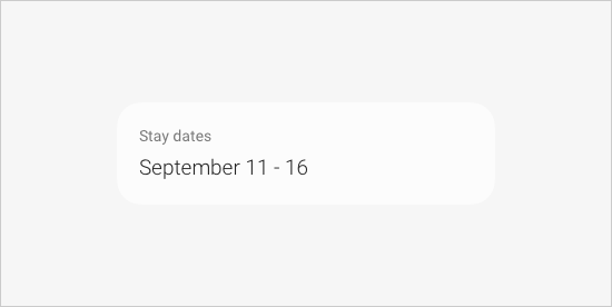
For any other user information you might need, you can use one of the input view pickers. For example, for the dates of a stay, use a date-picker.
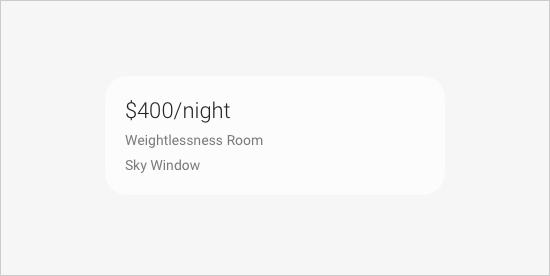
For Confirmations
Use non-interactive components for information that you need to summarize but users can't change, like in the examples of the following table.
image | cell-card without an on-click | title-area | single-line | paragraph |
|---|---|---|---|---|
 | 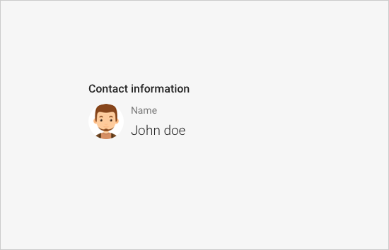 |  |  | 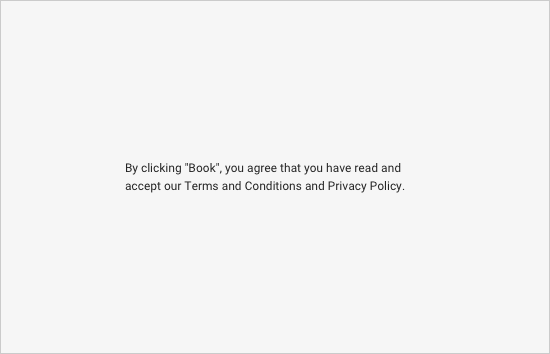 To include legal text, use the legal text style. |
Here are more examples:
Use input-cell or split-input-cell for information that users can change.
input-cell |
|---|
 |
Here are more examples:
Design Tips
These design tips are primarily for regular Bixby Views. If you are also designing for Flexible UX, see the Design Considerations for Flexible UX guide.
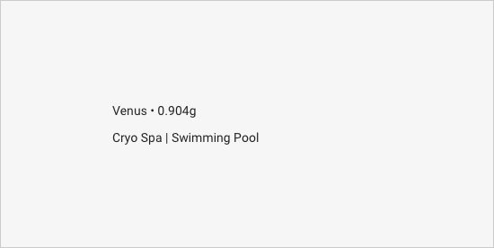
Simple and Minimal Information
Be intentional about the information hierarchy. You shouldn't try to recreate a touch-based UI application. Bixby Views components work well with simple and minimal information.
User: "Find the best space resort on Venus."
The following table shows a Do this! and Don't do this! example.
| Do this! | Don't do this! |
|---|---|
|  |
Design With Dialog
Bixby is a voice-forward experience, so always make sure you're designing for both the content that users see and dialog, and that they work well together.
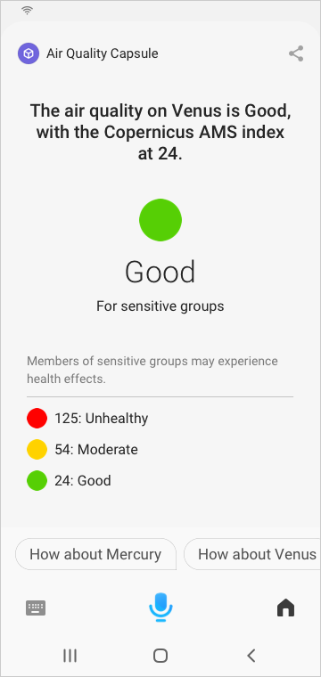
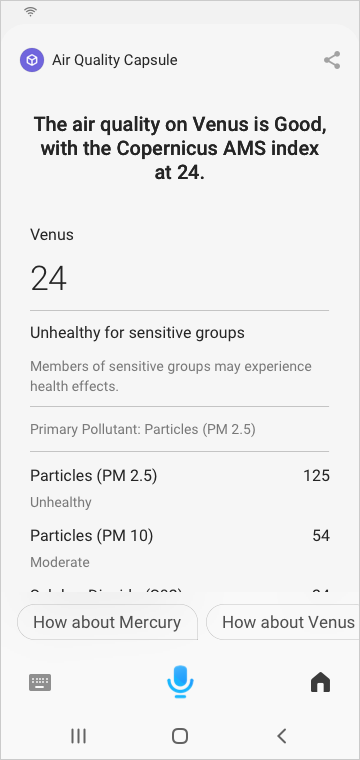
User: "What's the air quality on Venus today?"
The following table shows a Do this! and Don't do this! example.
| Do this! | Don't do this! |
|---|---|
 |  |
Provide Curated Content
A Bixby capsule should provide the most relevant content, based on the user's utterance.
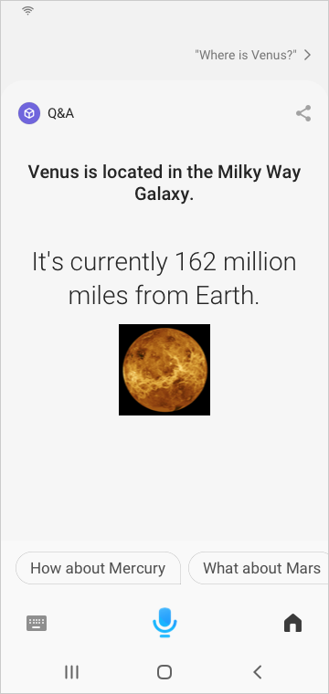
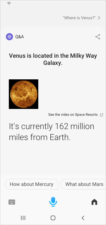
User: "Where is Venus?"
The following table shows a Do this! and Don't do this! example.
| Do this! | Don't do this! |
|---|---|
 | 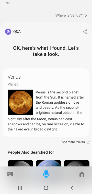 |
Allow the user to complete their request within Bixby Views. Hyperlinks should be avoided, as they take away inline follow-up questions. To provide more detail for a piece of content that is summarized in the Bixby Views, you can have a separate link to punch-out if you need using an attribution-link. Do not visually treat external links the same as internal links.
Punch Out of Bixby Views
If you need to leave Bixby to launch a separate application through app punch-out, place this content at the end of your View using an attribution-link. You could also have a card at the end of your view that has an on-click which lets them leave Bixby, and the on-click should have an external-link-badge to let users know that tapping on the card will let them leave Bixby. You should not place this information in the start or middle of your content.
There are additional situations where you can use app-launch instead to direct the user outside of Bixby entirely. For more information on app punch-out, see the App Punch-Out Policies.
The following table shows a Do this! and Don't example.
| Do this! | Don't do this! |
|---|---|
 |   |
Additionally, when using an attribution-link or an on-click with an external-link-badge, the primary content in the view should not be clickable. For example, use a cell-card and no on-click defined, to make it into a cell area. Only one part of a component should be tappable, and not multiple parts.
Conclusion
If you follow all the case study steps and design tips, here is the Space Resorts design:
User: "Find the best Space Resort on the planet"
For more examples of Bixby Views and capsules in general, you can read and explore the various available sample capsules.