2019 April–June
Internal platform changes that are not visible to capsule developers will be communicated via internal status updates.
19K Capsule SDK Release Notes
Updated: June 19, 2019
System-Provided Navigation Conversation Drivers
With the new with-navigation-conversation-drivers key, you can now add localized, system-provided conversation drivers for "Next" and "Previous" paging commands without being required to hard-code them in your capsule code.
Example
result-view {
  match: MyStruct (this) {
    from-output: ReadOneAction
  }

  render {
    list-of (this) {
      navigation-mode {
        read-one {
          with-navigation-conversation-drivers
          page-content {
            underflow-statement (This is the first candidate)
            item-selection-question (Do you want this one?)
            overflow-statement (That's all I have)
            overflow-question (What would you want to do?)
          }
        }
      }

      where-each (item) {
        spoken-summary ("#{value(item)}")
        layout-match (item) {
          mode (Summary)
        }
      }
    }
  }
}Currently, system-provided conversation drivers only support the en-US locale, though others will be added soon. If you use system-provided conversation drivers for other locales, they will not cause an error and will automatically appear when the specific locale is supported.
Local Endpoint Preconditions Deprecated
You must now explicitly import all Bixby-provided JavaScript libraries, such as console and http. For more information, see JavaScript API reference.
Deprecation Stages
Learn more about the deprecation stages.
- Stage 1: R19O
- Stage 2: R19P
- End of Life: R19V
Conversation Drivers within Activity Support
We've added the ability to add conversation drivers to the detail-view of activity-support.
As a result, we've reorganized the way you declare a detail-view block, as shown below.
Examples
Deprecated:
activity-support {
  match {
    MyReceipt (this)
  }

  time(statusRefreshTime)

  states {
    if (orderState == 'Ordered') {
      state (Scheduled) {
        expires(statusRefreshTime)
        summary-view {
          title (--Scheduled summary title--)
          message (Scheduled summary message)
          details(**Scheduled summary details)
        }
        detail-view {
          layout-match(this) {
          mode(Details)
          }
        }
      }
    }
  }
}New:
activity-support {
  match {
    MyReceipt (this)
  }

  time(statusRefreshTime)

  states {
    if (orderState == 'Ordered') {
      state (Scheduled) {
        expires(statusRefreshTime)
        summary-view {
          title (--Scheduled summary title--)
          details(**Scheduled summary details)
        }
        detail-view {
          render {
            layout-match (this) {
              mode (Details)
            }
          }
          conversation-drivers {
            conversation-driver (conversation driver inside detail-view)
          }
        }
      }
    }
  }
}
Bixby Views Duration Picker
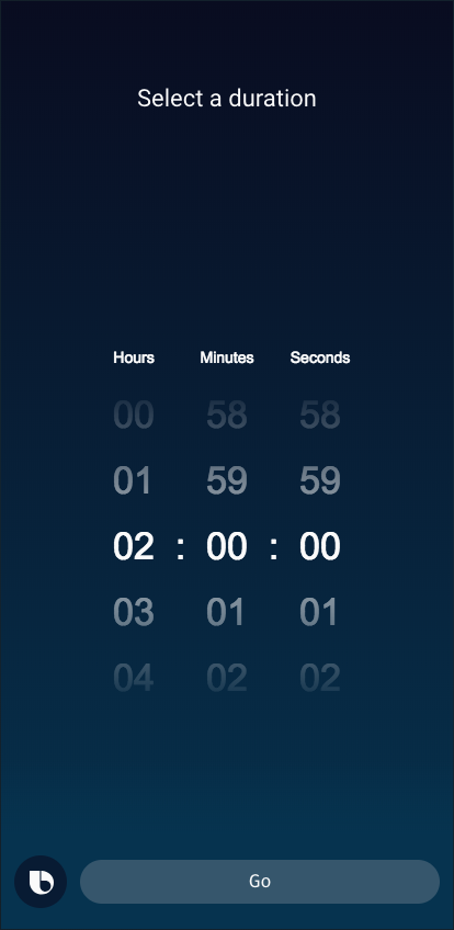
You now have the ability to add a duration-picker within Input View components. A duration picker is a full-screen component that lets users select a duration of time.
19J Capsule SDK Release Notes
Updated: June 7, 2019
Runtime Flag for Dialog on Detail Pages
We've added a new allow-dialogs-on-detail-pages runtime flag that allows your capsule to show dialog when users progress from a summary view to a detail view.
New 'isElement' EL Function
To support the new allow-dialogs-on-details-pages runtime flag, we've also introduced the isElement Expression Language (EL) function, which returns true if the node is an element of an array. This occurs when the node is being accessed with an array-style iterator such as for-each and where-each.
When rendering a details view for an item that is reached through list-of.where-each, the isElement function continues to return true for that item. This allows you to use isElement in result-view.message blocks to determine if your result-view is for a details view (in other words, an element selected from an array or collection of results).
Example
result-view {
  match: Donut (result)

  message {
    if (size(result) == 0) {
      template ("no donuts!")
    } else-if (size(result) == 1) {
      if (isElement(result)) {
        template ("details for a donut!") // <--------- example of crafting a custom message for the details page
      } else-if {
        template ("only 1 donut!")
      }
    } else {
      template ("#{size(result)} donuts!")
    }
  }
  ...
}
Read more about EL node evaluation functions.
Updates to 'capsule-info.bxb' File
We've made a number of updates to the capsule-info.bxb file, which allows you to provide information about your capsule, such as the name, website, and branding images:
- Renamed top-level
descriptionkey tocapsule-info. - Replaced
companyNamewithdeveloper-name. - Deprecated all related camel-case keys, which have been replaced with hyphenated variants.
- Deprecated
name, which has been replaced withdisplay-name. iconUrlhas been deprecated, which has been replaced withicon-asset.- Added new option to include up to 10
screenshots.
Learn more about setting up your capsule's capsule-info.bxb file.
Examples
Deprecated:
description {
  name (Tip Calculator)
  displayName(Tip Calculator)
  iconUrl (/images/icons/gratuity.png)
  imageUrl (/images/icons/gratuity.png)
  description (Calculate the appropriate gratuity for a given service.)
  dispatch-name (tip calculator)
  dispatch-aliases {
    alias (tip calculator app)
    alias (gratuity calculator)
    alias (gratuity calculator app)
    alias (tips)
    alias (gratuity)
  }
  websiteUrl (http://bixby.samsung.com/)
}
New:
capsule-info {
  display-name (Tip Calculator)
  icon-asset (/images/icons/gratuity.png) // must be local asset
  image-asset (/images/icons/gratuity.png) // must be local asset
  description (Calculate the appropriate gratuity for a given service.)
  dispatch-name (tip calculator)
  dispatch-aliases {
    alias (tip calculator app)
    alias (gratuity calculator)
    alias (gratuity calculator app)
    alias (tips)
    alias (gratuity)
  }
  website-url (http://bixby.samsung.com/)

  screenshots {
    asset (/foo/fi/foh/fum.jpg)
    asset (https://example.com/image.jpg) // ERROR, only local assets
  }
}
Deprecation Stages
Learn more about the deprecation stages.
- Stage 1: R19O
- Stage 2: R19O
- End of Life: R19U
Bixby Views Updates
We've added the object-fit option for image-carousel. This new key determines how an image fits within a Bixby Views component.
19I Capsule SDK Release Notes
Updated: May 22, 2019
Updates to Ranges for Decimals and Integer Concepts
We've added a new recognized-range key, which is used with decimal and integer concepts to set a range of acceptable values with a lower bound (min-value) and an upper bound (max-value).
Because recognized-range is part of features, you can have related values inherited by sub-types that use role-of or extends if you set the concepts-inherit-super-type-features runtime flag.
The previous method has been deprecated.
For more information, see Modeling Concepts.
Deprecation Stages
Learn more about the deprecation stages.
- Stage 1: R19I
- Stage 2: R19O
- End of Life: R19U
Ordinal Selection Utterances
We've added a few more reserved utterances related to ordinal selections. Examples include:
(first)[v:OrdinalSelector]the (first)[v:OrdinalSelector] oneyes the (first)[v:OrdinalSelector] one
With ordinal selections, users can replace "first" with any number, such as "third" or "fifth", for example.
Read more about Reserved Utterances.
Bixby Views Enhancements
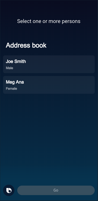
We are introducing the header key, which replaces the title key within list-of in result views. You can also use a header at the top of a selection-of list in input views.
...
header {
    title-area {
        halign (Start)
        slot1 {
            single-line {
                text {
                style (Title_M)
                value ("Address book")
                }
            }
        }
    }
}
...
Here is how the header appears on mobile:
Additionally, to help you specify the positioning of an image within an image content box, we've added a new object-position key to image-card, image, and thumbnail-card.
Finally, you can now add a background-color to images, which defaults to transparent but can be set to white.
New Error When Extending Concepts as Roles
We now show an error when you try to add or override properties within a concept that is a role-of a parent concept. You should instead use extends.
For more information, see Relationships Between Concepts.
Deprecation Stages
Learn more about the deprecation stages.
- Stage 1: R19I
- Stage 2: R19O
- End of Life: R19U
19H Capsule SDK Release Notes
Updated: May 10, 2019
Changes to refresh
We are deprecating the following keys related to refresh and introducing the corresponding replacements to make refresh more consistent with other parts of the Bixby platform and allow for cascading control flow.
- Deprecating
refresh.condition, replaced with inner control flow that uses standard conditionals - Deprecating
refresh.delay, replaced withrefresh.spec.delay-seconds. This key also permits expressions such asthis.flightNumber + 1. - Deprecating
refresh.on-refresh, replaced withrefresh.spec.with-request. This key also allows for cascading control flow.
Examples
Deprecated:
  refresh {
    condition("(size(this) == 1) and (this.flightState == 'active')")
    delay(60)
    on-refresh {
      intent {
        goal {FlightStatus}
        value {$expr(this.carrier)}
        value {$expr(this.flightNumber)}
      }
    }
  }
New:
  refresh {
    if ((size(this) == 1) and (this.flightState == 'active')) {
        spec {
          delay-seconds (this.flightNumber)
          with-request {
            if (true) { // obviously optional, for demonstration purposes only
              intent {
                goal {FlightStatus}
                value {$expr(this.carrier)}
                value {$expr(this.flightNumber)}
              }
            }
          }
        }
      }
    }
  }
New Template Sample Capsules
We’ve added new Template sample capsules that you can use as a starting point for your own capsules! There are currently two templates available: one for facts/jokes and one for quiz.
19G Capsule SDK Release Notes
Updated: April 19, 2019
Bixby Views Enhancements
Bixby Views now supports a lightbox-enabled toggle on an image.
Lightbox mode enabled (
true):
Lightbox mode disabled (
false):
Additionally, you can now include a single-line within any slot of a title-area.
New Runtime Flag for Inheritance
We've introduced the new concepts-inherit-super-type-features runtime flag that allows concepts to inherit features (such as transient or preferable) when extending or being a role-of their parent type (also known as super-type):
Example:
capsule {
  ...
  runtime-flags {
    concepts-inherit-super-type-features
  }
}
Hands-Free List Navigation Updates
We've made several updates to Hands-Free List Navigation, especially related to navigation-mode:
- The new
item-summary-join-modekey controls how lists are concatenated in spoken summaries. - The new
spoken-summarykey provides a spoken summary of the current item in awhere-eachloop. - The new
page-markerkey provides spoken guidance during list navigation to indicate which page of items the user is currently on. NewisFirstNavPageandisLastNavPagepagination functions are available through Expression Language to support this key. - The
overflow-statement,underflow-statement,item-selection-question, andoverflow-questionkeys are now under apage-contentkey, along withpage-markeranditem-summary-join-mode.
Learn more about Hands-Free List Navigation.
New Reserved Utterances
We've added a few more reserved utterances (also known as meta-commands), which are commands that have specific meanings in particular situations:
- "next option"
- "what did you say"
- "no thank you"
- "no more"
Read more about Reserved Utterances.
19F Capsule SDK Release Notes
Updated: April 11, 2019
Bixby Views Enhancements
Within Bixby Views, you can now have for-each loops within a single-line.
Additionally, you can add a shape to an image in single-line.
Promote Capsule Admins in Developer Center
You now have the ability to promote (or demote) capsule admins within the Developer Center.
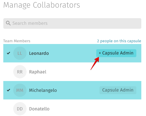
Learn more on how to Add Capsule Admins and the things you can do as a capsule admin.